Optimization of the capacity information display in local public transport

Optimization of the capacity information display in local public transport
Partner
Deutsche Bahn
Our services
Product & Project Management
Data Analysis
User Research
Prototyping
UX / UI Design
Partnering with Deutsche Bahn, a leading authority in railway transportation, we pursued the strategic goal of optimizing how users can quickly grasp crucial carriage occupancy information on a limited display for orientation on the platform.
Our approach: Information is only useful to people if it is designed according to their needs. That's why user research was particularly necessary for optimizing the real-time capacity data information design.
35+
Quantitative, qualitative interviews both in-panel and in-field
4
Design UX / UI Design approaches
700+
Displays in Berlin alone
Designing for Accessibility: Discovering layout options for optimal user experience
From the begining we knew that a design that works in all distances is a must! So we started by doing lot of discovery and testing.
We initially explored various layout options to optimize the limited screen space without causing user confusion. This included rearranging elements within the existing layout, relocating the platform number, and experimenting with animation effects, such as dynamic movement of destination text to reveal train capacity.
"A design never stands alone; it must be tested within the context of its usage."
Nina Wilken
Strategic Project Manager, Taikonauten
Conducting user testing to optimize the limited screen space
Our collaborative efforts with Deutsche Bahn were deeply rooted in User-Centered Design practices, prioritizing clarity and accessibility to enhance the passenger orientation.
After the initial user feedback from a user panel, we adapted our explorations and start to play with other parameters like size of the wagons, and filling versus stroke.
Unlocking Clarity: Navigating perception and patterns in display design
After our initial explorations it was validated that the solution was all about perception. So we decided to start exploring patterns, the best way to express different states from a distance throught perception.
We also received more information about the display’s so we started to approach the layouts in the smallest size of the screen 96x64 pixels to ensure that every digital interface is intuitive, accessible, and engaging, regardless of distance or device.
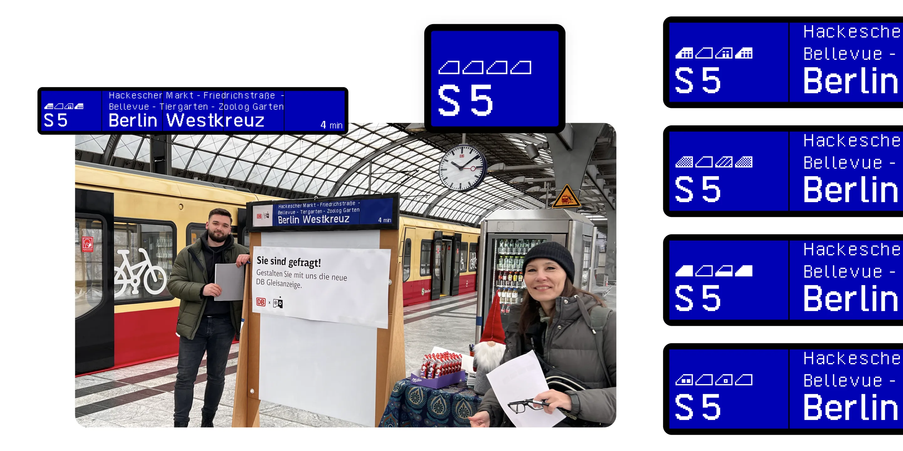
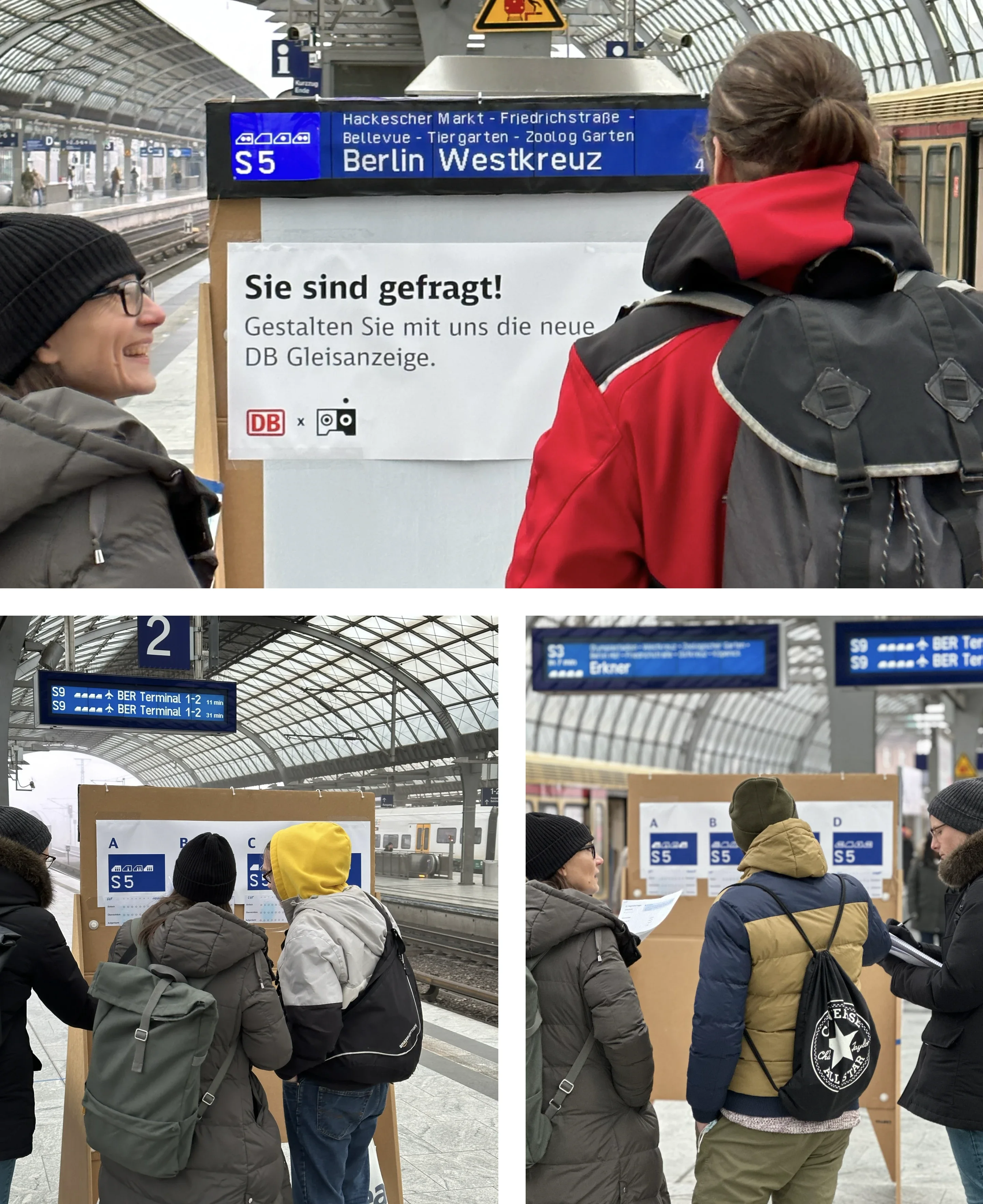
Ready for real-world testing at train station: Learning from users to refine our information design approach
Sometimes you need quick feedback, so we decided to use a field study on the station track. Our user research aimed to ensure that travelers could easily recognize and understand the new visualization at a glance.
For our field test setup, we printed giant real-size versions of the layout and integrated an iPad onto the prints to showcase four different approaches. Each approach varied in the implementation of the occupancy information:
- People
- Patern
- Filling level
- Dots
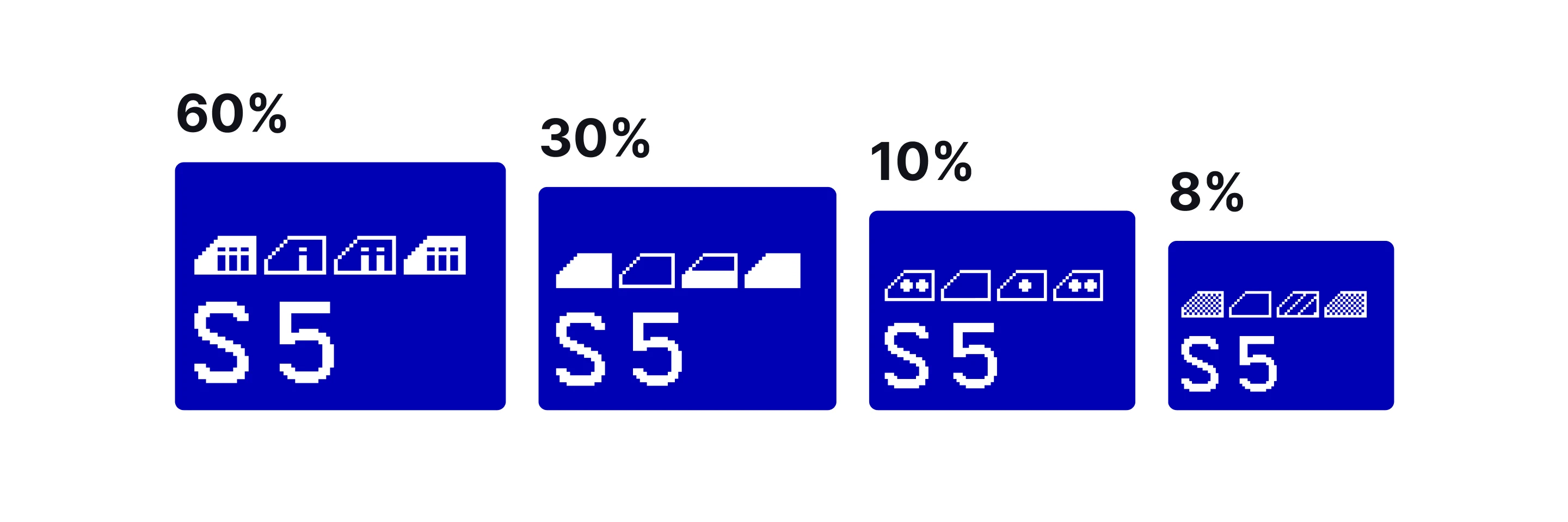
The field test involved presenting the four different design options side by side, enabling users to vote, rate, and discuss their preferences.
Empowering design with user insights: Enhancing platform display experience
All variants were rated by the test subjects on a User Experience Questionnaire (UEQ) scale. In the end, the respondents favored one of the variants shown (60%).
In addition, we collected qualitative insights into why users made their decisions. These insights then formed the basis for clear recommendations to achieve a consistent and accessible user experience at the platform display.